In recent years, far too many elections have been marred by ballot design flaws in contests where voter error rates exceeded the margin of victory. Based on our review of the ballots from several counties in Georgia, there are a number of challenges in the Senate contests that could cause voters to mark their ballot contrary to their intent. Given their national importance and the likelihood of a close vote, it is critical that election officials, campaigns, and get-out-the vote organizations educate voters to avoid errors.
In the race for the regularly scheduled seat, there are three candidates: incumbent Republican David Perdue, Democrat Jon Ossoff, and Libertarian Shane Hazel. In the special election to replace Sen. Johnny Isakson (R), who resigned last December due to health problems, there are 20 candidates plus a write-in option.
Below we identify four challenges that are of particular concern, followed by suggestions for how to alert voters to these problems and reduce the potential for voter error.
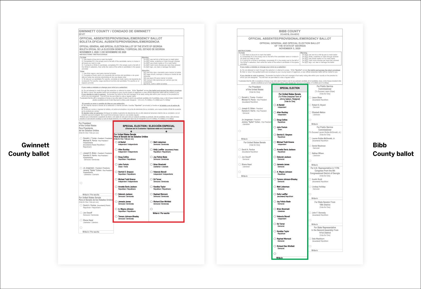
The special Senate contest: Gwinnett County’s paper ballot may invite high numbers of overvotes
The long list of candidates in the special Senate election presents a real design challenge: how can the ballot design clearly show voters the full list of candidates with no confusion about where the contest begins and ends?
While most Georgia counties have been able to fit all the candidates in a single column, Gwinnett County split the contest into two columns, because adding the required Spanish text to the header takes up more space at the top of the first page.
This is one of the biggest design mistakes we have seen since we began reviewing ballots more than a decade ago, because voters interpret the two columns as belonging to different contests and vote once in each column, thereby invalidating their vote.
This is an especially big challenge for voting by mail, because there is no message from a polling place scanner or an electronic marking screen warning that a voter has selected more candidates than allowed.
 Oxide Design Co.
Overvoting on paper ballots when a contest is broken over two columns happens far too often, as we illustrated in our 2008 report Better Ballots and in our 2012 report Better Design, Better Elections.
For instance, in the 2016 California Senate primary election, where counties had to fit 34 candidates from the same contest onto the ballot, over half the counties listed the Senate candidates in more than one column. In some counties, voters could scan their ballots in the polling place, where machines could alert them of potential errors. In others, all ballots were tabulated at a central location, which provided no such safety net. The multi-column ballot format coupled with the central ballot tabulation produced an overvote rate of 4.9 percent, compared to 0.9 percent in counties with a single column format and central ballot tabulation.
While the lost votes resulting from multiple columns (close to 215,000 lost votes) were a drop in the bucket against totals in California, in a county as populous as Gwinnett and in such a tight race, these lost votes could prove consequential. If the general election is consistent with the primary, where over 350,000 people turned out to vote, and where 50 percent of turnout was by mail, an overvote rate of 4.9 percent could mean more than 8,500 lost votes. Given that turnout is likely to exceed what we saw in the primary and most voters who vote absentee will likely be voting on paper ballots for the first time, we can expect that these numbers could be even higher.
 Oxide Design Co.
The regular Senate contest: Paper ballots do not use shading to help voters see contest boundaries
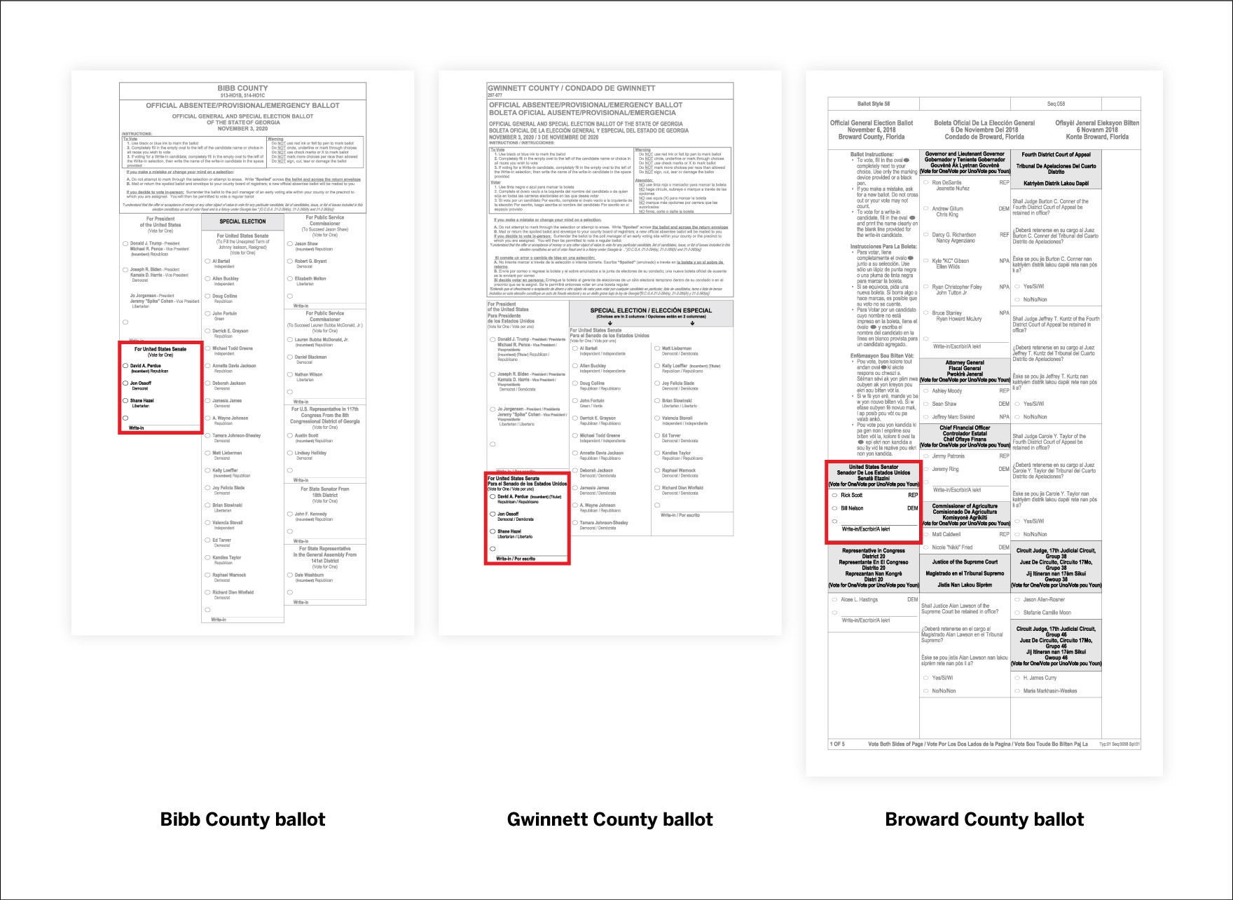
Another design flaw that seems common across counties: a lack of shading to differentiate one contest from another. In all ballots we reviewed, the “Special Election” header is shaded gray, but none of the other office contest titles are, making it more difficult for voters to differentiate between contests and potentially resulting in voters missing contests, especially with only three candidates in the regular Senate contest.
This happened in the 2008 general election in East Saint Louis, Illinois, where a failure to differentiate between contests with proper shading and borders led many voters to overlook the U.S. Senate contest and resulted in a lost-vote rate that was more than double the state average.
The lack of proper shading is particularly worrisome on the Gwinnett ballot, where the regular Senate contest starts much further down the page below the presidential contest, where it is easier to overlook.
 Oxide Design Co.
This is reminiscent of Florida’s Broward County 2018 general election ballot. In that election, both the contest for senator and representative in the House were positioned below long instructions that went almost all the way down the first column of a 17.5” ballot.
Although the design issues are different, the result — a high number of lost votes due to voters accidentally skipping over the Senate contest — could be similar. Again, the problem is worse in Gwinnett County, where the contest starts 3” lower on the page than in other counties. After making a choice for president, a voter’s eyes could be drawn to the shaded and more prominent “Special Election” header to the right and overlook the other Senate contest.
Electronic machines: Multiple screens for one contest and multiple contests on one screen
Georgians who vote in person will most likely mark their ballots using a ballot marking device rather than pen and paper. It is best practice for touchscreen ballots to only have one contest per screen, with a clearly visible control to allow voters to page down to see all choices. Ballot marking devices have the advantages of preventing overvotes and providing a printed ballot that voters can verify before casting their ballot, but scrolling through a long list can still be difficult, especially for undecided voters.
Multiple screens for one contest
The Atlanta Journal-Constitution reports that the 21-candidate special Senate election was programmed to keep all candidates on a single screen, displaying them in two columns to avoid the need to scroll between the top and bottom of the list.
Unfortunately, the new layout — which is not standard for the system — was apparently not robustly tested before it was delivered to the counties. During pre-election testing, two counties discovered that if a voter flipped back and forth between contests, the second column would sometimes not appear. As a result, all machines need to be reprogrammed.
We don’t know if the fix will be a programming correction or if the state will decide to use the single column layout used for all other contests and display this long contest into more than one screen. But either solution can be a problem for voters.
Assuming the screen is laid out in a single column, candidates at the top of the alphabet may have an advantage, while candidates at the end of the alphabet appear on a second or third screen and therefore might be at a disadvantage if voters don’t realize the they need to scroll to find additional candidate names.
In order to deal with this potential issue, campaigns will want to figure out where their candidate is on the machine interface and remind supporters to use the “scroll down” button or to look for a candidate on the second screen. Election officials should inform campaigns and the public how this contest will appear on the touchscreens as soon as they know.
Multiple contests on one screen
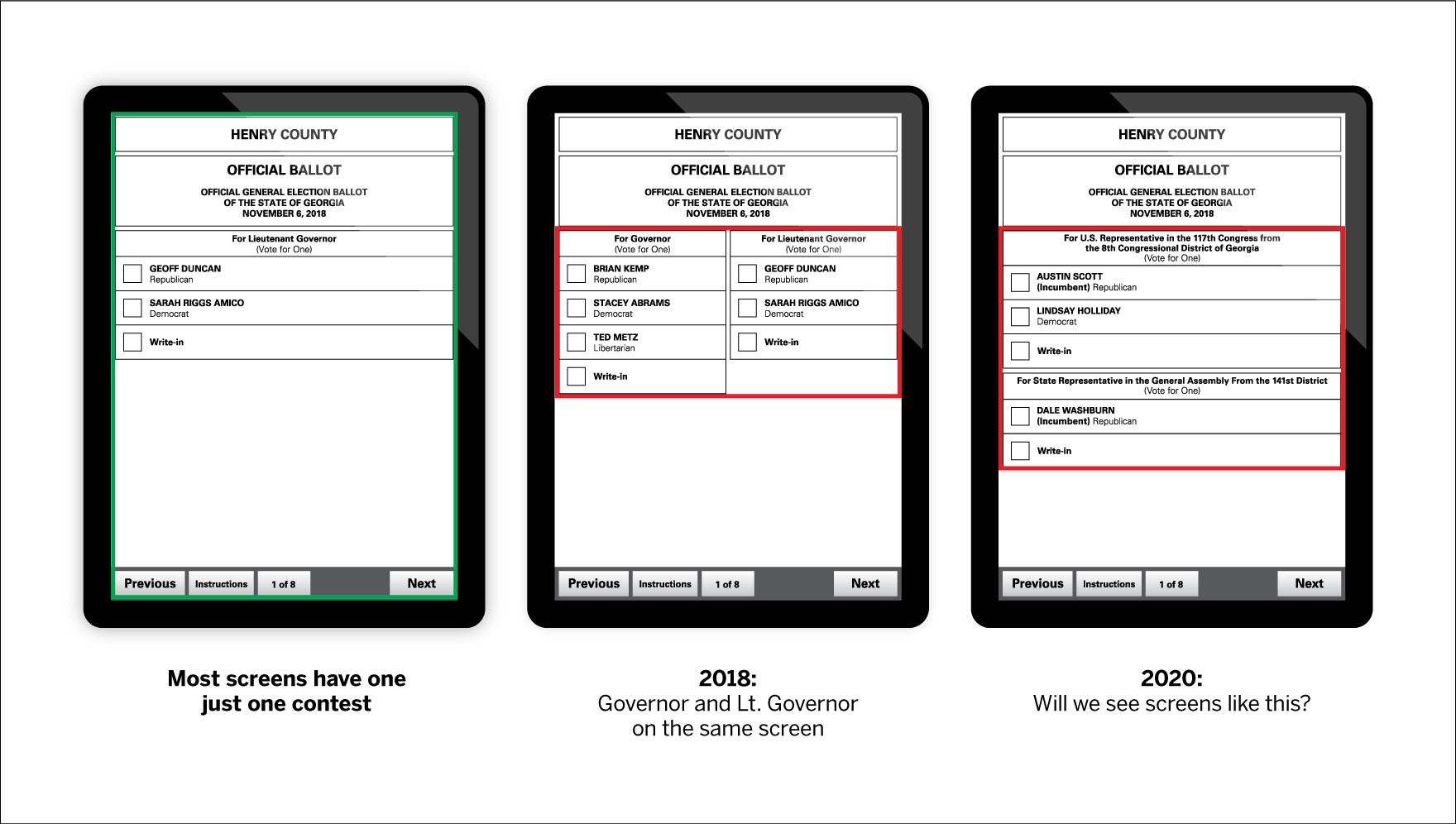
The flip side of the problem of too many candidates for one screen is listing multiple contests on the same screen. This is something we have seen in Georgia before, in contravention of a basic principle of interface usability. ATMs, for example, generally ask one question at a time and proceed to a new screen only after the user has answered the previous question. People are far more likely to miss questions if they are asked to answer more than one at a time.
Although we have not yet seen what electronic ballots in Georgia will look like, multiple contests were placed on a single screen during 2018 midterm election. In particular, some counties displayed candidates for lieutenant governor on the same screen as candidates for other contests, such as governor. Most likely as a result of this, there were far fewer votes for the lieutenant governor contest than others.
 Oxide
Oxide
Voter education is critical to saving votes
Absentee ballots have gone out to voters and electronic ballot layouts are almost set for voting machines. Although it may be too late to make any changes to the ballots, effective voter education can help reduce errors.
We have seen it work before. In 2008, North Carolina engaged in a massive voter education effort to combat a confusing straight party ticket rule that had historically led to many lost votes for president. Poll workers were trained to give voters verbal instructions about the straight ticket option and included with each ballot a special slip of paper that detailed the same information. These efforts contributed to a substantial decrease in the residual vote rate for the presidential contest, from 2.2 percent rate in 2004 to 1.0 percent in 2008.
Voter education from both election officials, campaigns, and get-out-the-vote groups will be critical to avoid lost votes in Georgia in 2020.
For mail voting, voter education includes:
- Highlighting for voters that there are two Senate contests, one that will be in the lower left-hand corner, just below the presidential contest, and one “special election” that will start in the second column.
- In Gwinnett County, voter education that shows the ballot layout so that voters are aware of the large list of candidates and understand to only fill out one oval in the Special Election, even though the contest is broken into two columns.
For in-person voting, signage at polling place should include:
- Which contests will share a screen
- Which contests (if any) will require them to use the scroll-down button to see all the candidates
- Reminders to voters to review their selections on-screen and check their paper ballot carefully to be sure they have voted in every contest they intended to vote in.
Finally, everyone, no matter how they’re voting, should be reminded that there are two Senate contests and that they should check their ballot for errors before returning it by mail or casting it a polling place.


